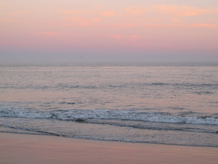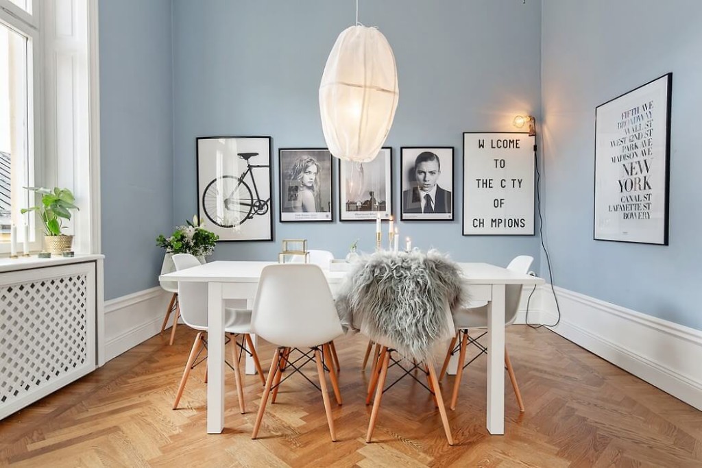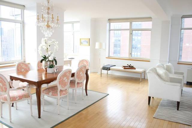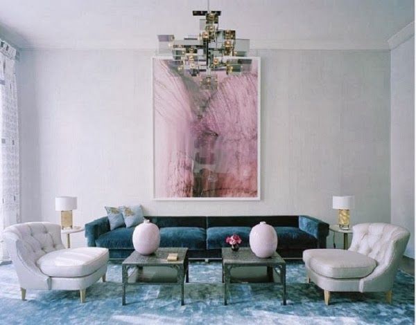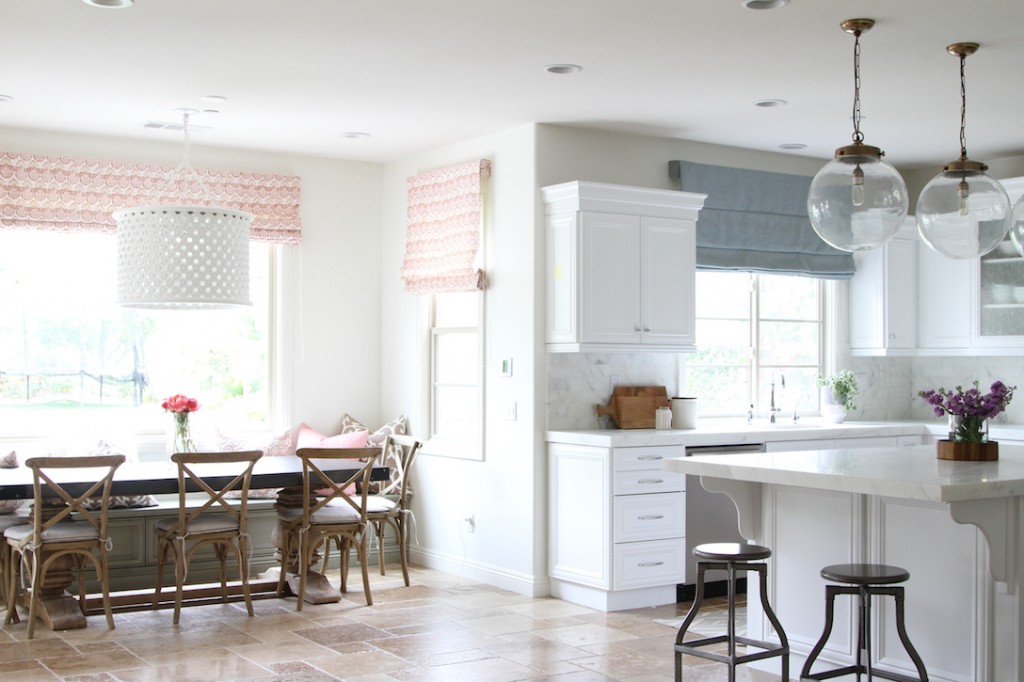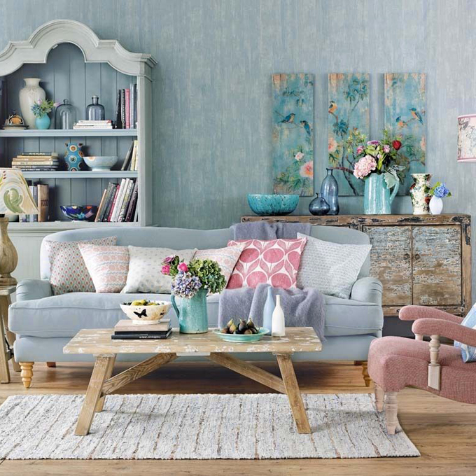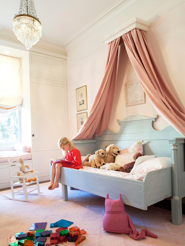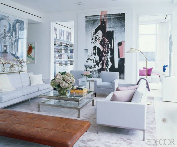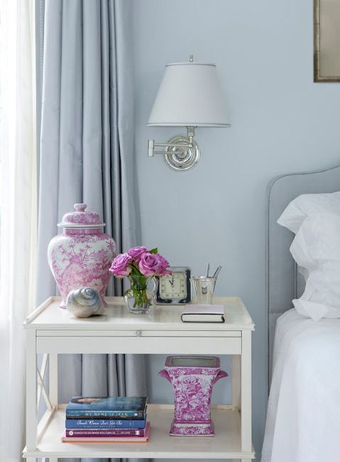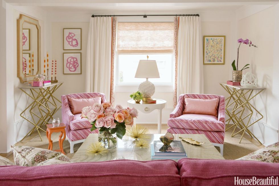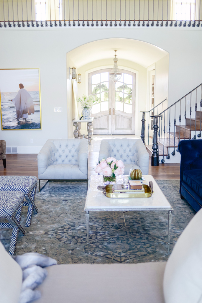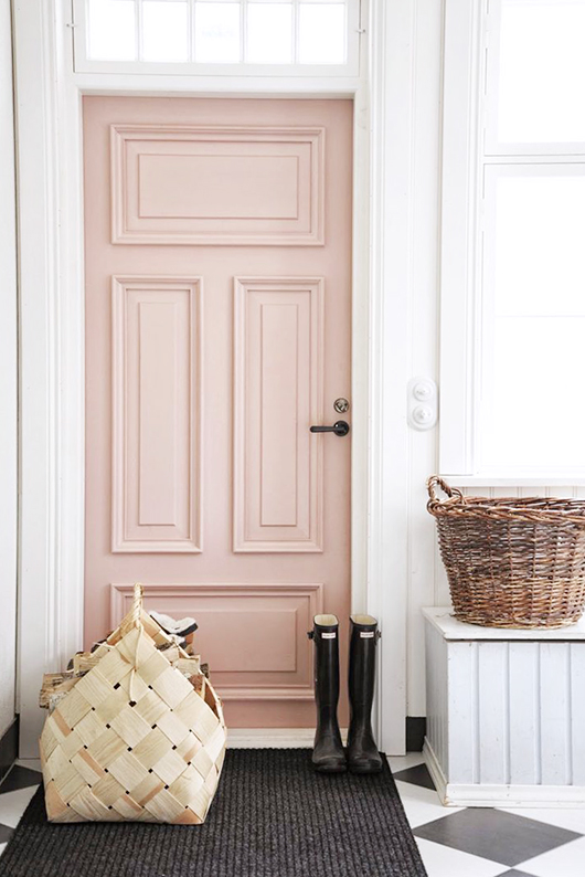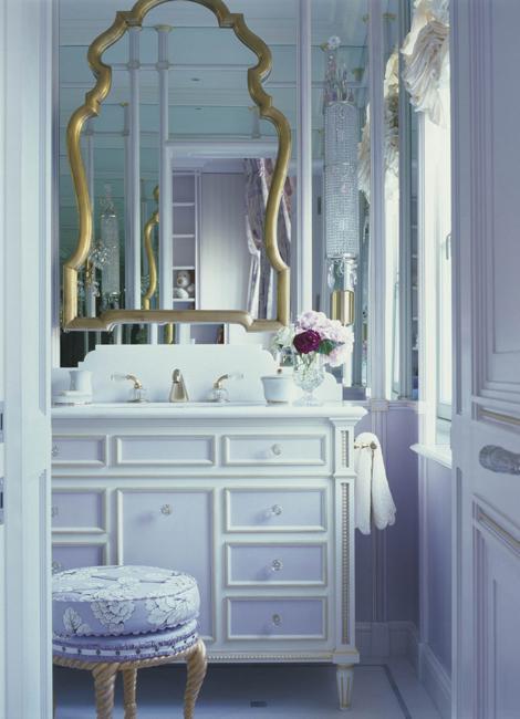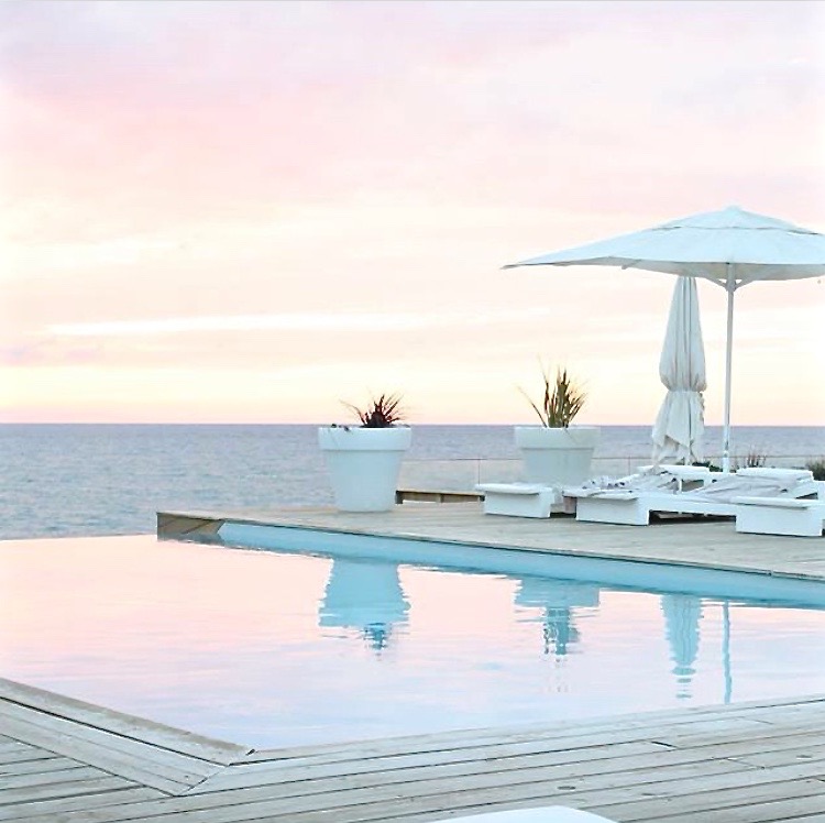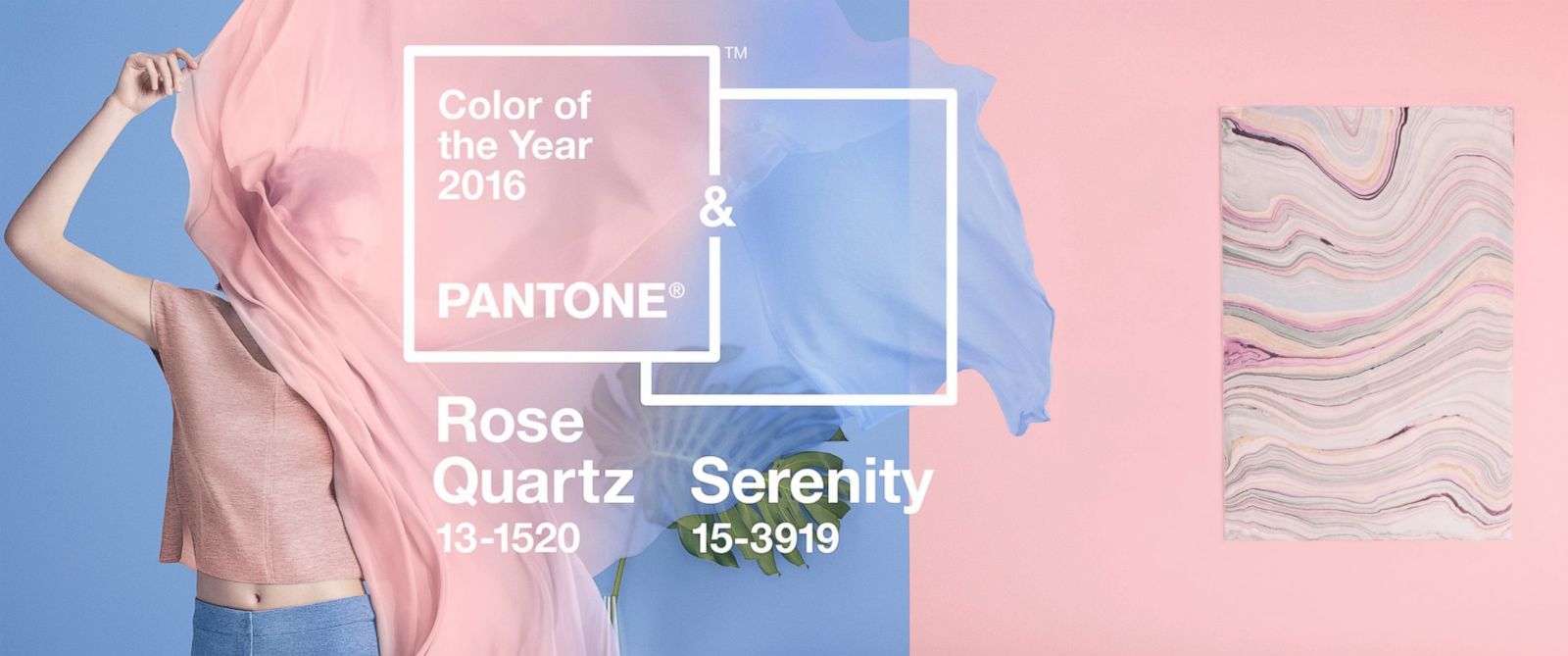
Pantone’s paint color of the year 2016 has just been announced… In a surprising move Pantone released two colors this year instead of just the one. Pantone has captured everyone’s attention with the choices, Serenity and Rose Quartz. This bold move has shifted the notion that pink and blue are meant for nurseries and gender description. You can bet the interior design world has taken note and many will shift to a softer more pale direction as a result.
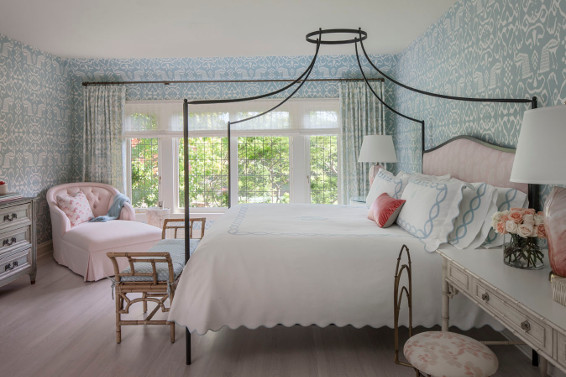
Pantone emphasizes that by blending the two shades, the soft complementary colors fulfill a calming reassurance. I couldn’t agree more. I’ve always been a fan of mixing the two colors in my home and have found that whisper soft hues when combined provide a warm relaxed mood. The shades can be brought together in simple ways… like flowers and home decor or in a larger more engaging method like paint, wallpaper and art can reflect. The best part of the two color announcement? You decide how you want to marry the two.
You will find several examples of the two shades coexisting in a successful manner below as well as some of my favorite finds to help introduce both shades to your spaces. I find the peaceful paler shades of blue and pink while calming definitely move interiors to fresh level that are not only sophisticated but elegant.
Happy Friday! xo
Click to Shop ~
